SaaSculator part 2 - first features & initial design
This is part of a series about building my side project SaaSculator. Each part covers my experiences and learnings while developing. The topics include the development, design, marketing & running of this project. You can find all parts here.
Determine the MVP features
Alright, let’s get to actually building something. The first step was making a list of the most important features I want SaaSculator to have. As determined in the first part the goal is to make the costs of payment providers comparable, while showing the user the different effects providers have on the product pricing. From there on I break this down into the following core features:
specify multiple products
have a selection of the most popular payment providers
show a detailed breakdown of the costs
No surprises here. Of course, there are already a ton of (potential) future feature ideas spinning around in my head: use localized pricing for different countries, include chargeback costs, add additional costs for extra services, etc. … But for now, I want to focus on getting the most important parts working with a simple design and then add further features. Because what usually happens is that I keep adding stuff to my list of “super important” features that it just keeps growing and growing, and eventually delaying my launch.
No, this time I want to deliberately practice creating one feature after the other and always keep shipping in between. No major changes but small and steady steps towards my desired goal.
Starting with a basic design
Now that I know what to build, I start designing a first draft of what I want this app to look like. This has always been the hardest part for me, as I believed that I just was not capable of creating good designs. I was sure that it’s a skill you either have or don’t have. Therefore, I was blown away when I first read Steve Schoger’s hot Twitter tips, because it suddenly felt like something I could learn and improve on. His and Adam Wathan’s Refactoring UI was eye-opening for me, because it immediately made creating (at least) decent looking UIs accessible to me.
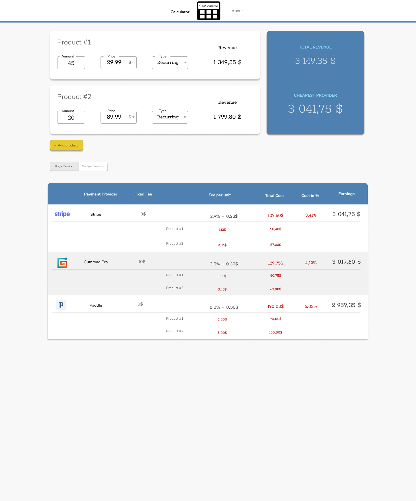
So, heading over to Figma, my free design tool of choice, I start drawing the most basic version of SaaSculator. The result looked something like this:

Nothing too fancy (or fancy at all for that matter), but it gets the job done for now. It is most certainly going to change during development. But it’s good enough to start with.
My reasoning for the design
I wanted the user to be able to immediately change the products price and amount, customizing it from the beginning. The table and revenue numbers should automatically update, giving the user instant feedback but more importantly making the UI a bit more self-explaining. You change one number here and immediately see changes over there: Which parts are changed by the price? Which by the number of products sold? How are they connected?

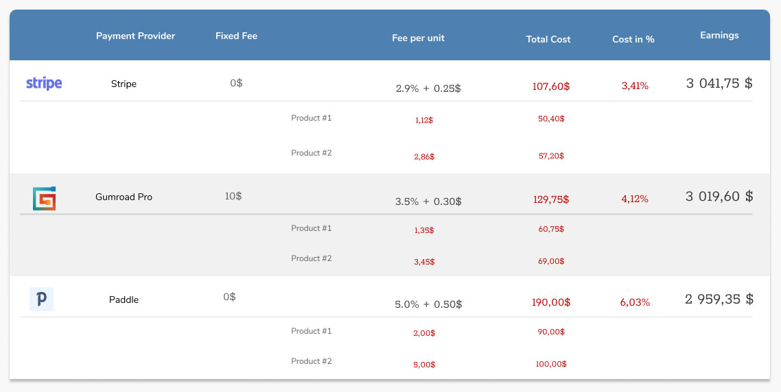
The table itself should show the cost for each provider but also what they are comprised of. Which products cost you how much? How does the cost change, depending on the price of the product?
 All in all, the design looks simple and not very professional (yet) but it is enough for me to start working on the implementation. Which is what the next part is going to cover.