SaaSculator part 7 – getting user feedback & usage statistics
Table of Contents
This is part of a series about building my side project SaaSculator. Each part covers my experiences and learnings while developing. The topics include the development, design, marketing & running of this project. You can find all parts here.
In the last part I launched saasculator.com on Netlify. Now that it’s out there I want to make sure that I notice when users actually start using it. That is why in this part I am going to include analytics and a feedback form, along with small design improvements. Additionally, I will make the current design responsive.
Setting up basic analytics
Creating and launching a website is fun but knowing that people use it is the real deal! Therefore, my next step is setting up Google Analytics & registering with Google’s Search Console. Analytics is great, because it shows you when you get users and how they use your website. Especially for a simple website such as SaaSculator, the options to know if your site is used are limited. There are no user registration, newsletter or products to buy which would show you when its used. At the same time Search Console is a great help in identifying structural problems your app may have. From blocked resources in your robots.txt to faulty markup or schema.org declarations.
Getting feedback – Netlify forms
Another thing that was missing was a way to get in contact with me. Using Netlify adding a form to your static website is a breeze. You drop a form with a data-netlify attribute set to true in your HTML and Netlify pretty much handles the rest. In my case, the simple feedback form looks like this:
<div class="shadow-lg px-8 py-4 mt-6 border border-gray-200 rounded-lg">
        <div class="bg-gray-200 px-8 py-4 rounded-lg mb-4">
          <p class="text-sm text-gray-700">If you have feedback or want to suggest something to me, please feel free to write me!</p>
        </div>
        <form name="feedback" method="POST" netlify-honeypot="occupation" data-netlify="true">
          <input type="hidden" name="form-name" value="feedback" />
          <div class="flex flex-col invisible">
            <label for="occupation" class="px-2 text-sm h-0">Occupation</label>
            <div class="border-2 border-gray-300 rounded-lg h-0">
                <input id="occupation" name="occupation" type="text" class="px-4 w-full text-xl h-0">
            </div>
          </div>
          <div class="flex flex-col mb-4">
            <label for="name" class="px-2 text-sm">Name</label>
            <div class="border-2 border-gray-300 rounded-lg">
                <input id="name" name="name" type="text" class="px-4 w-full text-xl w-32 h-12">
            </div>
          </div>
          <div class="flex flex-col mb-4">
            <label for="email" class="px-2 text-sm">Email</label>
            <div class="border-2 border-gray-300 rounded-lg">
                <input id="email" name="email" type="email" class="px-4 w-full text-xl w-32 h-12">
            </div>
          </div>
          <div class="flex flex-col">
            <label for="message" class="px-2 text-sm">Message</label>
            <div class="border-2 border-gray-300 rounded-lg">
                <textarea id="message" name="message" class="px-4 mt-4 w-full text-lg w-32 h-40"></textarea>
            </div>
          </div>
          <p class="flex justify-end w-full text-right mt-6">
            <button type="submit" name="submit" class="flex flex-row items-center bg-gray-700 px-8 py-2 rounded-lg text-white font-semibold">
              <font-awesome :icon="['fal', 'paper-plane']" class="fa-w-16 mr-2"/> Send
            </button>
          </p>
        </form>
      </div>
The line directly below opening the form tag, gives the form submissions their name within Netlify’s backend.
<input type="hidden" name="form-name" value="feedback" />The next input is a Honeypot field. It’s goal is to discard submissions that have a value for this field. Users won’t see it, so they won’t enter any information. But (most) spam bots will fill out this field, which shows Netlify that its spam and they will discard it, so you don’t even have to delete it yourself.
<div class="flex flex-col invisible">
    <label for="occupation" class="px-2 text-sm h-0">Occupation</label>
    <div class="border-2 border-gray-300 rounded-lg h-0">
        <input id="occupation" name="occupation" type="text" class="px-4 w-full text-xl h-0">
    </div>
</div>
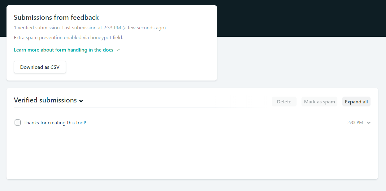
There are some more options to customize the behavior after submissions or for adding captchas. You can find them here. After a form is submitted you can immediately see the contents in the Netlify backend.

Small design tweaks & responsiveness
I found some minor things to tweak and change in the design, added a custom favicon as well as links to the payment providers. But the biggest improvement was making the design responsive. What took me immense amounts of time, sweat and tears in my early days as a web developer, took about an hour using Tailwind CSS.
The process consists of hopping between desktop and mobile view, while adding prefixed variants (e.g. sm:, md:, lg:) of the utilities to the code. Basically, everything was created using un-prefixed utilities and for a desktop view. Then I would hop to the mobile view and change the utilities that needed to change, while prefixing their old value with the appropriate size (mostly lg:), because the old values were for the desktop (=lg) view.
All in all, the changes were quickly implemented but very important. There is now a responsive design and a way for me to see when users start to use the app.
In the next part I will find out how to save the products of users without them losing everything after a page refresh.